You are not logged in. Click here
 to log in.

codebeamer Application Lifecycle Management (ALM)
WidgetsThis page introduces the different widget types available. Table of Contents
Adding WidgetsSeveral types of widgets can be added to the project Wiki page by clicking on the
After clicking on the desired widget, the widget editor overlay is opened where the widgets can be customized. To finalize a widget and have it displayed on the Dashboard, click [Save].
Widget TypesReport VisualizationReport Visualization Widgets show the actual result of the reports.
Supported chart types:
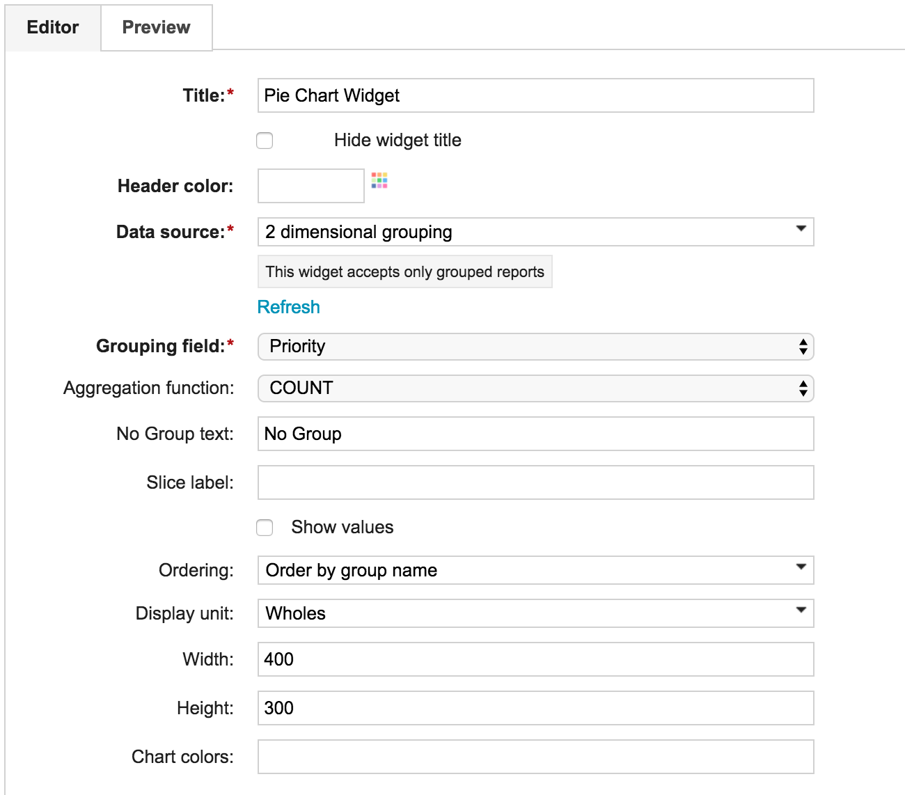
The Report Visualization Widgets have a common Editor format:
The most important fields of the Editor:
CBQL Tablecodebeamer displays work items that are based on various cbQL tables.
ChartChart widgets unify the previously standalone report visualization widgets, making it possible to change the chart types after creating the widgets. The configuration options for each widget types remained the same.
TableThe Table widget displays the result of reports in tabular form.
Further options available on the editor overlay:
ProjectActivity StreamProvides an aggregated view of all recently performed activities within a project.
See Item Count By FieldDisplays the distribution of items by Status field values within the actual project.
See Item Count TrendsDisplays the number of created items compared to the resolved items.
See My Open Tracker ItemsDisplays a summary of unresolved work items submitted by, assigned to or supervised by the current user.
See My ReviewsDisplays the list of reviews assigned to the current user.
See Project Activity TrendsShows the number of activities performed over time for the selected project in the specified reporting period, with the specified details.
See Project ListDisplays the list of projects accessible by the current user.
See Review ListDisplays the latest review result of each item in a report result.
See Risk Matrix DiagramShows the number of Requirements, User Stories or Risk Items according to the probability and severity of the relevant risk.
See Traceability ReportSince Codebeamer release HUSKY, the Traceability Browser widget has been renamed to Traceability Report widget with no change in its general operation. The Traceability Report widget displays a traceability report according to the provided settings. Clicking the Show Source Traceability Report link opens the relevant Traceability Report page. See also: Tracker Class DiagramDisplays a tracker configuration diagram.
See Tracker History Audit TrailShows the tracker configuration change history of tracker items within the selected project.
See Tracker ListDisplays all trackers of the selected project, along with statistics.
See Tracker State TransitionDisplays a workflow diagram of a tracker.
AgileBurn Down ChartDisplays the open work items of a release of sprint.
See Burn Up ChartDisplays the number of closed items compared to the total number of items over time.
See Current VelocityShows the velocity of the last working day within a release or sprint.
The Data Source affects the way the values are displayed:
See Release Activity TrendsDisplays the list of available releases and sprints of the relevant project with the number of work items (optional) and a burn down chart per release or sprint.
See Release Gantt ChartDisplays the selected release and the related sprints, or, the selected sprint and the related sub-sprints, and referencing releases, if any. Releases that do not have any planned start and release dates are displayed with fictitious schedules.
See Release StatsShows statistics about a release for which the Release Dashboard page is used as database.
See Remaining TimeDisplays the number of days remaining until the planned release date.
See
Sprint Break DownShows the status distribution of all issues in a Release or Sprint.
See
Velocity TrendsDisplays the changing velocity of a Release or a Sprint.
See TestRequirements CoverageShows the test or other work item coverage of the requirements.
The following two tracker types can be set, but only one at a time:
See Test Cases By Last Run ResultDisplays the results of the latest run test cases in a pie chart.
See Test Runs By AssigneeShows all test runs within a project or test run tracker. Consists of a single bar for each user who have executed test runs, and another bar for the test runs that have no assignees.The bars show the distribution of the results of the runs performed by a given user.
See Test Runs By ConfigurationDisplays all or only the selected test runs of a project based on the results, grouped by Test Configurations.
See Test Runs By Test SetShows the distribution of the test run results of the selected test set.
See PersonalMy Current ItemsDisplays the list of items (except for the ones in Resolved or Closed statuses) assigned to the current user. The items are set in a descending order by priority and last modification date.
See My SubscriptionsDisplays the entities the current user has subscribed to.
See User ProfileDisplays the user profile information of the current user.
See OtherWiki MarkupWraps a wiki markup into a widget and makes it reusable on dashboards.
Further OptionsOnce a widget is created, further options are available by clicking on the
Widgets can be:
Aligning Pinned WidgetsDashboard in codebeamer supports exactly one full-length widget on top of the dashboard. Depending on the size of the widget, the following alignment options can be selected:
StretchingStretching is the default value. It should be selected for all Widgets which benefit from taking up all available space (for example, Table and Release Gantt Chart Widgets).
LeftDisplays the widget on the left side of the screen. All of the following options only make sense if the widget has a fixed width.
CenterAligns the widget to the center of the screen.
RightDisplays the widget on the right side of the screen.
Deprecated Widgets
Deprecated widgets are still part of codebeamer, but are considered outdated and are not available on the Widget Browser overlay in recent releases. Deprecated widgets present on dashboards do still work, however, it is not possible to add further instances of these widgets to the dashboard.
Area ChartWith this widget type, time series can be visualized. The editor accepts only Reports grouped by a date field. The chart connects the points with straight lines (even when a date is missing between two consecutive points).
Bar ChartThis widget has three different modes:
Gauge ChartDisplays a range of values.
Special fields on the Editor overlay:
Speedometer Chart
Special fields on the Editor overlay:
TroubleshootingIn case several widgets are added to a dashboard, some of the widgets might not get loaded. To avoid such issues, the affected widgets must add data-deferred="true" to an HTML element rendered by the widget. When all actions finished, affected widgets must trigger the renderfinished custom event to inform the application about this fact.
See also: |

codebeamer Overview codebeamer Knowledge Base Services by Intland Software |
 anonymous


 Hotkeys