You are not logged in. Click here
 to log in.

codebeamer Application Lifecycle Management (ALM)
Wiki Markup and PluginsThis page provides a detailed summary and description about the Wiki formatting options and plugins available. Table of Contents
Basic FormattingWriting Text---- = Make a horizontal ruler. Extra '-' is ignored.
\\ = Force a line break, \\\=force line break and clear.
// comment = markup comment line (nothing is rendered)
[link] = Creates a hyperlink to an internal wiki page called 'link'.
[alias|link] = Creates a hyperlink to an internal wiki page called 'link', but displays the text 'alias' to the user instead of 'link'.
[1] = Makes a reference to a footnote numbered 1.
[#1] = Marks the footnote number as 1.
[[link] = Creates text '[link]'.
~[link~] = Creates text '[link]' by escaping the square brackets with the tilde character.
!1 heading = Large heading with text 'heading'
!2 heading = Medium heading with text 'heading'
!3 heading = Small heading with text 'heading'
!4 heading = Smaller heading with text 'heading'
!5 heading = Smallest heading with text 'heading'
''text'' = Prints 'text' in italic.
__text__ = Prints 'text' in bold.
{{text}} = Prints 'text' in monospaced font.
^^text^^ = Prints 'text' in superscript.
,,text,, = Prints 'text' in subscript.
* text = Makes a bulleted list item with 'text'
# text = Makes a numbered list item with 'text'
;term:ex = Makes a definition for 'term' with the explanation 'ex'
You do not need to know anything about the Wiki text formatting rules to use Wiki. You just need to write normal text, and then use an empty line to mark it as a paragraph. It's just like writing a simple email. HyperlinksLinks can also be direct URLs starting with http://, ftp://, mailto:, https://, or news:,in these cases the link points to an external entity. For example, to point at the official Sun Java homepage, use [http://java.sun.com], which is changed to http://java.sun.com/ Advanced: System administrators can also allow custom schemes and custom URL formats by configuring it : Preformatted TextIf you want to add pre-formatted text (like code) just use three consecutive braces ({) to open a block, and three consecutive braces (}) to close a block. QuotesIf you want to quote some text (e.g. a previous comment written by someone else), just add a greater sign (>) in front of that text. >> This is a very old comment. > This is a question that I quote. And this is my answer.
This is a very old comment.This is a question that I quote. And this is my answer. CommentsA good use for the ';:' is that you can use it to give a short comment on other people's text, by having an empty 'term' in the definition, like shown below: ;:''Comment here.''
Which would be seen as
PicturesExternal PicturesYou can embed external pictures by using the following markup: [http://www.intland.com/images/intland_01.gif]
You can also assign a URL to the inline picture: [http://www.intland.com|http://www.intland.com/images/intland_01.gif]
If you specify a link text that is not a valid URL, it becomes the ALT text for those who either cannot or do not want to view images. Links with PicturesThe example below shows the Yahoo online / offline graphics and creates a link to the Yahoo send message: [{Image src='http://opi.yahoo.com/online?u=YahooUser1234&m=g&t=2' border='0' height='30'
link='http://edit.yahoo.com/config/send_webmesg?.target=YahooUser1234&.src=pg'}]
See more examples of resizing and styling at the plugin's own webpage Image plugin supports following parameters:
Slideshow with ThumbnailsThe example shows how to display internal and external images with thumbnails. [{ThumbnailImage width='300' height='300'
[sometext|!pasted.png!]
[alias|https://lh3.googleusercontent.com/-6MXnUYxdpb8/Ux8uNOHiZfI/AAAAAAAAAAk/lk3TXPjf6dk/s630-fcrop64=1,00000000ffffffff/Intland-Software-Google.png]
}]
The images have to be listed in the body part of the plugin (two new lines after parameters), same wiki syntax applies as in and section Thumbnail plugin supports following parameters:
Automatically Sizing/Shrinking Images in Wiki to Fit on Page and Using ThumbnailsIf you have larger images - like screenshots - added to a Wiki page or an Issue/Bug's description it may happen that the image will push out the boundaries of the page and ruin its layout. To fix this situation you can use a special Wiki markup (a CSS class) which if used will automatically resize and shrink the large images. If this markup is used the "shrunk" images can be clicked on when a slideshow and overlay will open to show them in their original/larger size. For example this markup will render the image which will shrink if the image does not find on the page: %%thumbnailImages [https://intland.com/wp-content/uploads/2016/02/slider-home-2-automotive.png] [https://intland.com/wp-content/uploads/2016/02/slider-home-2-medical.png] %%
Will render this:  
The simple "%%thumbnailImages" markup will shrink the image if that is too large, so that is good for avoiding overly large images. Alternatively you can add real thumbnails of your images if you know your thumbnail size in advance. For example this markup will show a 200px wide thumbnail of the previous image, and by clicking on it will show the larger version: %%thumbnailImages200px ... images... %% The following CSS classes can be used:
Pictures from Page- and Issue AttachmentsYou can easily display pictures attached to the current wiki page: [!mypic.jpg!]
This will display the most recent picture with this name from the page attachments. This syntax can be used also in issue descriptions to display picture attachments of the issue (ex: screenshots). You can also refer explicitly to a specific picture revision (Wiki page attachments only): [!mypic.jpg#1!]
You can also display inline pictures that are attached to other pages: [!My favourite page/mypic.jpg!]
To inline pictures attached to an issue, into a Wiki page other than the issue description, you must specify the issue via an interwiki link: [![ISSUE:4711]/attachment.gif!]
Alternatively a picture can be viewed inline by using its attachment identifier: [!28!]
You can create links for all these markups: [http://www.intland.com|!mypic.jpg!] [http://www.intland.com|!My favourite page/mypic.jpg!] [http://www.intland.com|!28!]
Or you can even use Interwiki links with the attached pictures: [BUG:1000|!mypic.jpg!] [PROJ:1|!My favourite page/mypic.jpg!] [DOC:1000|!28!] Pictures from "Documents"As with wiki attachments, pictures that are stored in the document managements system can be viewed inline: [!/My pictures/Buttons/button.gif!]
You can use also its document identifier: [!/1723!]
You can also refer to a specific version of a picture: [!/My pictures/Buttons/button.gif#2!] [!/1723#2!]
You can create links also for these: [http://www.intland.com|!/My pictures/Buttons/button.gif!] [http://www.intland.com|!/1723!]
Copying an image from a Wikitext field and pasting it into another Wiki page or Tracker Item creates a hyperlink to that image, but will not add it as an attachment to the destination.
When displaying the image from the hyperlink, the followings are checked:
 . .ListsBulleted ListsUse an asterisk ( * ) in the first column to make bulleted lists. Use more asterisks for deeper indentation. For example: * One * Two * Three ** Three.One
Creates:
Numbered ListsSimilar to that of bulleted lists, but you use a hash ( # ) instead of the asterisk. Like shown below: # One # Two # Three ## Three.One
Creates
If you want to write the list item on multiple lines, just add one or more spaces on the next line and the line will be automatically added to the previous item.
We can continue the second sentence on a line of its own. We might as well do a third line while we are at it... Notice, however, as all these sentences get put inside a single item!
See Advanced formatting for complex list examples. Definition ListsA simple way to make definition-lists is to use the ;:-construct: ;__Term__:''Explanation of the term''
that renders as: TermExplanation of the term TablesYou can do simple tables by using pipe signs ('|'). Use double pipe signs to start the heading of a table, and single pipe signs to then write the rows of the table. End with a line that is not a table. For example: || Heading 1 || Heading 2 | ''Gobble'' | Bar | [Main] | [SandBox]
gives you the following table. Note how you can use links also inside tables.
See Advanced formatting for complex table examples. Advanced FormattingText StylesText ColorIn addition to the simple styles represented by the regular wiki markup, we also allow you to put in your own styles. For example:
%%red
This is red text.%%
This is red text.
first %%blue second%%third
To correct the markup use the %! markup for closing the block:
first %%blue second%!third Styles for the following colors are pre-defined:
blue
cyan
gray
green
magenta
orange
pink
red
yellow
Text Size and Alignment%%small this %% = Smaller than normal font %%sub aij = aji %% = Subscript %%sup 23 = 8 %% = Superscript %%strike hardly readable %% = Strikethrough text %%(text-align:center) !centered text = Centered text %! %%(text-align:right) !left-to-right text = Left-to-right text %! %%(text-align:left) !right-to-left text = Right-to-left text %! Custom Text StylesYou can also define almost any CSS style command: %%( font-size: 150%; color: green; ) Hello, world!%%
Hello, world!
Text BoxesInformation, Warning and Error BoxesThe following special block markers are supported: %%information Draft version %% %%warning Low disk space %% %%error Out of memory %%
Video Box%%videobox You may find a tutorial video in the Knowledge Base. %%You may find a tutorial video in the Knowledge Base. Collapsable BoxWhen closed only the title of the collapsable box is visible, when opened the complete box becomes visible. Do not forget to use one of the wiki heading styles in the first row of body text, otherwise the handle will not appear. %%collapsebox !! Title of the Box Here is the body of the box %% Title of the BoxHere is the body of the boxComment BoxSee this example comment box to the right and below this section. %%commentbox __Hi there!__ %%
Hi there!
It's actually quite possible to do things like put comment boxes like this directly on your wiki page. This sample comment box uses the "commentbox" style, as defined in the included "jspwiki.css" style sheet. To make a box like this, just use %%commentbox <text> %%. Tabbed SectionsWhen the page loads, only the first tabbed section will be visible. All other sections are hidden, until you click the corresponding tab. You have to surround all tabbed sections with a tabbedSection style. Next, start each tabbed section with a style prefixed with tab-. %%tabbedSection %%tab-ThisIsMyFirstTab Some text inside the first tab. %% %%tab-ThisIsMyLastTab Some other text inside the second tab. %% %%
Some text inside the first tab.
Some other text inside the second tab.
Collapsable ListsYou can turn ordinary lists into collapsable trees by enclosing them inside a collapse style. %%collapse * RDBMS ** Commercial *** DB2 *** Oracle ** Free *** MySQL %%
Advanced TablesTable PluginThis plugin extends the basic table markup with the following features:
You can easily organize any content into grid layout with this: [{Table
|[{ProjectList}] |(vertical-align:top;) [{MySubscriptions}]
|^ |(vertical-align:top;) [{PullRequests}]
}]
See more details on the plugin's home page Zebra Striped TablesYou can render alternate row coloring for large tables. by enclosing them inside zebra- tags. You can specify the odd and even colors using HTML hex color values or HTML color names like aqua, black, blue, fuchsia, gray, green, lime, maroon, navy, olive, purple, red, silver, teal, white, yellow and transparent. %%zebra-#FFFFCE-#F0C000 || column-head1 || column-head2 | cell-data | cell data | cell-data | cell data | cell-data | cell data %%
Sortable TablesYou can make tables sortable by enclosing them inside a sortable block. Just click the column header and your table is sorted without a round-trip to the server. %%sortable || Title || Author || Published || Edition | book1 | zappy | 25-Feb-2005 | 5 | book2 | happy | 25-Jan-2005 | 19 | book3 | pappy | 23-Mar-2005 | 06 | book4 | dappy | 21-Apr-2005 | 199 | book5 | rappy | 25-Jul-2005 | 017 %%
Bar GraphsYou can translate a set of values into horizontal colored bars. You can specify both the color and the maximum length of the bars. %%graphBars-#F0C000-70 * %%gBar 20 %% apples * %%gBar 40 %% peers * %%gBar 60 %% bananas %%
Interwiki LinksBasic Link Types
Link StereotypesSince codebeamer 6.0, Interwiki links to issues [ISSUE:XXX] and configuration items [ITEM:XXX] can be customized via link stereotypes.
To associate an interwiki link with a stereotype, use: [<<stereotype>>|ISSUE:XXX]
Where stereotype is the name of the interwiki link stereotype, e.g. [<<infosheet>>|ISSUE:XXX] Global StereotypesGlobal interwiki link stereotypes are: proj, doc, wikipage, category, item, tracker, issue, infosheet, description, repository, changeset, push, src, user, query, dashboard
<infosheet>
   <link></link>
   <popup></popup>
   <body>columns=3, value.style=min-width: 18em, categories, namedPriority, severities, status, versions, subjects, platforms, description</body>
</infosheet>
This stereotype renders some target object attributes and the target description (no hyperlink) and is indented so be used as paragraph body in conjunction with a default interwiki link in the paragraph header: ![ISSUE:123] [<<infosheet>>|ISSUE:123] ![ISSUE:123] [<<infosheet>>|ISSUE:124]
Another default stereotype is description: <description> <link></link> <popup></popup> <body>description</body> </description>
As the name implies, this stereotype only renders the description of the referenced object, e.g. [<<description>>|ISSUE:124]
A stereotype definition consists of three parts, each of which can be empty.
In the body definition, you can also specify display settings as setting = value pairs.
Caution: Do not modify general.xml while codebeamer is running. Page Specific StereotypesYou can also define local interwiki link stereotypes for a page, by declaring the stereotype at the top of the page. [{SET <<stereotype>> = body}]
For example: [{SET <<special>> = status, namedPriority}]
[<<special>>|ISSUE:123]Wiki ContentTable of Contents Plugin[{TableOfContents}]
generates a table of contents for the current page by using the !!!, !! and ! headings as content entries. You can override the default title and apply numbering (starting with 100) to the entries like this: [{TableOfContents title='Topic map' numbered='true' start='100'}]
If you need a higher level TOC that covers several pages, you can specify what pages to include in what order by listing their names or IDs in the body text: [{TableOfContents title='EJB 3.0 Tutorial' numbered='true'
Stateless EJBs
Stateful EJBs
Transaction and Security
1261
Dependency Injection
1244
}]
Please note that the Table of Contents plugin cannot be placed in a heading or in an anchor. Tag Cloud Plugin[{TagCloud}]
displays the visual depiction of tags Project ContentProject List PluginPlugin to display the complete list of projects accessible by the current user. [{ProjectList}]
The projects listed can filtered by using the following optional parameters:
Filtering rules:
In addition, the output format can be specified: format='name|brief|full'
Usage examples: [{ProjectList id='12,1'}]
displays the projects with identifiers 12 and 1. [{ProjectList name='Test.*' format='brief'}]
will display all projects with names starting with "Test" in brief format. Project Info Plugin[{ProjectInfo}]
displays basic information about the current project. [{ProjectInfo projectId='2'}]
displays the same for the project with the identifier 2. Members Plugin[{Members}]
displays the members and administrators of the current project. [{Members projectId='2'}]
displays the same for another project.
Tracker List Plugin[{TrackerList}]
displays all trackers of the current project, with statistics. [{TrackerList projectId='2'}]
displays the same for another project. [{TrackerList items='work'}]
displays the work trackers of the current project, with statistics. [{TrackerList items='configuration'}]
displays the configuration trackers of the current project, with statistics. [{TrackerList items='both'}]
displays all trackers of the current project, with statistics (default) [{TrackerList sorting='name'}]
displays all trackers of the current project, with statistics, sorting by tracker name [{TrackerList sorting='key'}]
displays all trackers of the current project, with statistics, sorting by tracker key [{TrackerList sorting='lastmodified'}]
displays all trackers of the current project, with statistics, sorting by last modified date of tracker [{TrackerList sorting='type'}]
displays all trackers of the current project, with statistics, sorting by tracker type and name [{TrackerList types='Bugs,Requirements,Test Cases'}]
displays the Bug/Requirement/Test Cases trackers of the current project, only these kinds of trackers are shown. Note: You can use the tracker's type names as they appear on the UI, except that you must use English names for types. So you can use "Bug" or "Bugs" as filter, but cannot use "Fehler" here. [{TrackerList typesExcluded='Test Cases,Test Sets'}]
displays all trackers except the Test Case and Test Set types [{TrackerList detailedLayout='true'}]
Show the detailed layout/view of the tracker list, contains more information about the Word items in each tracker [{TrackerList trackerOrder='1,2,3'}]
Show the trackers in specific order if the trackerOrder parameter is present. This can contain tracker id-numbers in the desired order. Typically updated by the project configuration when drag-drop reordering the trackers on the plugin UI. Most Active Projects PluginThis plugin shows the top most max active projects either from the set specified via projectId or tag, otherwise from the current working set of the current user. The ranking score is calculated from activities in the specified reporting period (default 'Last 30 days'). [{MostActiveProjects period='Last 30 days' max='5'}]
shows the top 5 projects from the user working set, that had the most activity in the last 30 days. Project Activity Trends PluginThis plugin shows the number of activities (any kind of create, modify, delete and restore activity on tracker items and artifacts, like comments, attachments, wiki pages, documents, trackers and so on) over time for selected projects in the specified granularity and reporting period. Either the projects via the projectId parameter, whose value is a comma-separated list of project ids, or the tag parameter, whose value is comma separated list of tag names (only the tagged projects are considered) needs to be specified. A custom reporting period (default is 'Past 30 days') via the period parameter, and the granularity (daily, weekly, monthly) via the grouping parameter (default daily) can also be specified. By default, the activity trend is shown as a chart, however, the data can also be shown as a table via display='{chart|table|both}' [{ProjectActivityTrends projectId='2,4' period='Last 30 days' grouping='Daily'}]
Displays the activity trend of the projects with ID 2 and 4 for the last 30 days, daily. Activity Stream PluginThis plugin provides an aggregated view of all recent activities in a project, including wiki page and document creates, issue submissions, comments, forum posts, and such. [{ActivityStream}]
displays all recent activities in the enclosing project. When used in a personal wiki page, it displays all recent activities in all projects in which the user is a direct member. You can easily narrow down the displayed activities using the filter parameter: filter can be any combination of 'issue', 'commit', 'wikipage', 'document', 'build' and 'forum', separated by comma. [{ActivityStream projectId='2,4' title='Recently in the Development Project' cssStyle='-moz-box-shadow: 0 0 1em gray;' filter='issue,build' period='Last 3 months' max='10'}]
will display the 10 most recent issue submissions and updates, and the most recent builds in two other projects. [{ActivityStream tag='customer, client' title='Recently in the Customer Projects' max='30'}]
displays the activities from all projects tagged with "customer" or "client". Artifact Activity Trends Plugin[{ArtifactActivityTrends artifactId='1000'}]
displays the number of "reads" of a wiki page or document. [{ArtifactActivityTrends artifactId='1000,1002' display='table'}]
displays the "reads" of two wiki pages or documents, in a table. [{ArtifactActivityTrends title='Updates on MySql' tag='mysql, rdbms' activity='update' period='Past 30 days' display='both' cssStyle='background-color:#DEEFF6'}]
displays the "updates" of any wiki page or document tagged with "mysql" or "rdbms", for the past 30 days, both in a chart and in a table with a distinct background color. Artifact Count Trends Plugin[{ArtifactCountTrends}]
displays the number of wiki pages changing over time in the current project. [{ArtifactCountTrends projectId='11,27' type='document' display='table'}]
displays the total number of documents in two projects, in a table. [{ArtifactCountTrends title='Knowledge Base Size' tag='knowledge-base, kb' period='Past 30 days' display='both' cssStyle='background-color:#DEEFF6'}]
displays the total number of wiki pages in any project tagged with "knowledge-base" or "kb", for the past 30 days, both in a chart and in a table with a distinct background color. Issue Count Trends PluginIssue Count Trends plugin displays the number of issues created vs the number of issues resolved for a period of a time. This information can be displayed in either chart or table format. The chart image will show two lines of the issue progress: the green line indicates the total number of issues cumulative from the start of the period and the red shows the number of new issues. The coloring of this chart indicates the health of the project, simply saying: the green area will indicate that there are more bugs/issues being fixed than it is created, and if the red area is dominating that suggests that more resources and time should be spent on fixing the bugs. Parameters: Data-collection parameters:
Appearance parameters:
Samples: [{IssueCountTrends}]
displays the trend of the issues being created/resolved in the current project in the default period='Past 7 days' [{IssueCountTrends projectId='11,27' display='table'}]
displays the issue-trends in the nominated projects, and the chart is not shown but data is displayed in a table. [{IssueCountTrends trackerId='33,21' period='Last 13 weeks' grouping='weekly' display='both' cssStyle='background-color:#DEEFF6'}]
displays the issue trends in the trackers selected, both in a chart and in a table with a distinct background color, over the last 13 weeks, aggregated per calendar week. [{IssueCountTrends tag='enterprise' period='This Month'}]
displays the issue trends of the current month, computed from all trackers of the projects tagged with "enterprise". [{IssueCountTrends tag='funtional-req, nonfunctional-req, req' period='This year'}]
displays the issue trends of the current year, computed from all trackers in any project, that is accessible for the user and is tagged with at least one of the 3 listed tags. Issue Count By Field Plugin[{IssueCountByField}]
displays the issue distribution in the current project by the Status field. [{IssueCountByField projectId='11,27' display='table'}]
displays the issue distribution in two projects, in a table. [{IssueCountByField projectId='11,27' showHiddenTrackers='true' display='table'}]
displays the issue distribution in two projects including issues in hidden trackers, in a table. [{IssueCountByField projectId='11,27' types='Bugs' display='table'}]
displays the issue distribution in Bug trackers of the two projects, in a table. [{IssueCountByField trackerId='81,85' title='Bugs by Priority' field='priority' display='both'}]
displays the issue distribution in two trackers by Priority, both in a chart and in a table. The parameter field can be one of assignedto, category, detected, os, platform, priority, resolution, severity, status, submitter and target. [{IssueCountByField tag='java,mysql,acme-corp' title='Acme Corp. Issues' display='both' cssStyle='background-color:#DEEFF6'}]
displays the issue distribution in any project or tracker tagged with the listed tags, both in a chart and in a table with a distinct background color. [{IssueCountByField trackerId='81,85' includeClosed='false']
The parameter includeClosed can be true or false. If this option is false then the plugin skips 'Closed' issues. Release Activity Trends PluginRelease Activity Trends plugin displays the list of the available releases and sprints of the current project in a tree map with the number of the containing items and optionally a burn down chart per release/sprint. Parameters:
Samples: [{ReleaseActivityTrends}]
shows the unresolved releases/sprints of the current project with burn down charts, and displays the number of the unresolved items per release/sprint. The status dropdowns will be available in the header. [{ReleaseActivityTrends title='Project (3) Releases' projectId='3'}]
shows the unresolved releases/sprints of the project identified by id 3 with burn down charts, and displays the number of the unresolved items per release/sprint. The title of the plugin will be 'Project (3) Releases'. [{ReleaseActivityTrends showUnscheduledItems='true' showBurnDownChart='false' trackerItemStatus='Resolved'}]
shows the unresolved releases/sprints of the current project, displays the number of resolved items per release/sprint and the number of the unscheduled resolved items. The status dropdowns will be available in the header. [{ReleaseActivityTrends showDropdownFilters='false'}]
shows the unresolved releases/sprints of the current project with burn down charts, and displays the number of the unresolved items per release/sprint. The status dropdowns will not be available in the header. [{ReleaseActivityTrends projectId='3' showPlannerLink='true'}]
displays the Planner link icons will be shown in the plugin header to be able to navigate to the Planner page. [{ReleaseActivityTrends projectId='3' showCardboardLink='true'}]
displays the Cardboard link icons will be shown in the plugin header to be able to navigate to the Cardboard page. [{ReleaseActivityTrends projectId='3' showTraceabilityLink='true'}]
displays the Traceability link icons will be shown in the plugin header to be able to navigate to the Traceability page. [{ReleaseActivityTrends projectId='3' showTestCoverageLink='true'}]
displays the Test Coverage link icons will be shown in the plugin header to be able to navigate to the Test Coverage page. [{ReleaseActivityTrends projectId='3' showProductBacklogs='true'}]
displays the Product Backlog links will be shown in the table footer to be able to navigate to the selected Product Backlog. Release Gantt Chart PluginShows a gantt chart of the provided Release(s)/Sprint(s) and their Sprint(s)/Subsprint(s) and referencing Release(s) if exists. The chart displays Releases which do not have Planned Start-of-Work and Planned Release Date with a fictional schedule. Only 1 chart allowed on a wiki page. Parameters:
Sample: [{ReleaseGanttChart releaseIds='12345'}]
shows gantt chart of the Release identified by 12345. Risk Matrix Diagram PluginRisk Matrix Diagram Plugin shows the number of Requirement or User Story/Risk items according to the related Risk(s) likelihood and severity values. The plugin draws a matrix, the Y axis is the Likelihood values, the X axis is the Severity values, both are configured in a custom choice field in the Risk tracker (Likelihood intervals field, Severity intervals field). Furthermore you can configure also the background colors of the matrix cells in the Risk tracker configuration page, below the Risk management tab. Note that this plugin works properly only if the used risk tracker has proper field configuration! Parameters:
Samples: [{RiskMatrixDiagram trackerId='12345'}]
shows the number of Requirement/User Story items according to theirs related Risk(s) before reduction likelihood and severity values. Tracker identified by trackerId can be a Requirement/User Story or a Risk type tracker. [{RiskMatrixDiagram title='Risk Matrix Diagram' trackerId='12345'}]
same as above, additionally the plugin box will have title "Risk Matrix Diagram". [{RiskMatrixDiagram trackerId='12346' riskTrackerId='123456' reduction='after'}]
if the tracker identified by trackerId is a Requirement or User Story type tracker, the matrix will show the number of Requirement/User Story items according to theirs related Risk(s) after reduction likelihood and severity values. Only Risk items of the Risk tracker identified by riskTrackerId will be count. If tracker identified by trackerId is a Risk type tracker, riskTrackerId parameter will be ignored. Resourcing Extraction Plugin (Deprecated since 9.3.0)This plugin will be removed in the following release so please use Query Plugin [{Query id='9875'}]
It is necessary to create new Report to use Query Plugin. Resourcing Extraction Plugin shows the open tracker items (and their story points) group by projects and assigned members (user groups). Parameters:
Samples: [{ResourcingExtraction}]
Shows the open tracker items group by assigned members of the current project. If used outside project context, error thrown. [{ResourcingExtraction projectIds='12345,12346' displayGroups='true'}]
Shows the open tracker items group by assigned members of the projects identified by project IDs. All user groups will also display. [{ResourcingExtraction projectIds='12345,12346' displayGroups='true' groupIds='123,124'}]
Shows the open tracker items group by assigned members of the projects identified by project IDs. Provided user groups will also display. [{ResourcingExtraction projectIds='12345,12346' displayTeams='true' teamIds='123,124'}]
Shows the open tracker items group by assigned members of the projects identified by project IDs. Result will display group by teams (filtered by provided teamIds). [{ResourcingExtraction projectIds='12345,12346' fromDate='2015-01-01' toDate='2015-02-01'}]
Shows the open tracker items group by assigned members of the projects identified by project IDs. Tracker items will be filtered by provided date interval. My Open Tracker Items PluginMy Open Tracker Items Plugin shows a summary of 'Unresolved' work items submitted by, assigned to or supervised by the current user and matching specified criteria per project. Parameters:
Samples: [{MyOpenTrackerItemsPlugin}]
Shows the 'Unresolved' work items submitted by, assigned to or supervised by the current user and matching specified criteria per project. [{MyOpenTrackerItemsPlugin title='New title'}]
Shows same result but with a different title: 'New title' Tracker State Transition Chart PluginTracker State Transition Chart Plugin shows a workflow diagram of a tracker. Parameters:
Samples: [{TrackerStateTransitionChart trackerId='1234'}]
shows the workflow diagram of this tracker. Tracker Class Diagram Plugin(in codebeamer 8.3) Tracker Class Diagram Plugin shows a tracker configuration class diagram. Parameters:
The maximum number of the visible trackers is 30. If the project contains more than 30 trackers then use the trackerIds parameter to filter visible trackers. Samples: [{TrackerClassDiagram projectId='2' trackerIds='1234, 1235,1238'}]
shows the configuration diagram of the selected trackers. ReportingQueryExecutes a Report and shows the results in a table. Parameters:
Samples: [{Query id='9875'}]
executes Report with the identifier 9875 and displays the results in a table. Report Plugin (Vintage)Report Plugin executes report and displays the issues retrieved by the report. Parameters:
Samples: [{Report id='9875'}]
executes report with the identifier 9875 and displays the issues retrieved by the report. [{Report id='9875' limit='10'}]
executes report with the identifier 9875 and displays the first 10 issues retrieved by the report. Tracker Item State History Plugin[{TrackerItemStateHistory id='1000' showHeader='true'}]
shows the state change history of an issue (bug, task, etc.), identified by its task-id. Inside a comment of an issue page you can add this plugin without the "id" parameter, and the plugin will automatically show the state transitions of the current issue.
Tracker History Audit Trail Plugin[{TrackerHistoryAuditTrailPlugin}]
Displays the configuration change history of one or more trackers in the given project. Tracked changes include general tracker changes, field related changes and state transition changes. This plugin is also useful for checking the created baselines and the workflow diagram of a baseline.
Samples: [{TrackerHistoryAuditTrailPlugin trackerId='10001' showWorkflowChanges='true' showTransitionDiagrams='true'}]
displays workflow changes and transition diagrams for only one tracker. [{TrackerHistoryAuditTrailPlugin trackerId='10001,10002' showFieldChanges='true' showBaselineEntries='true' startBaseline='20000'}]
displays field changes including baseline entries for the two given trackers, changes are displayed which are created later than the specified start baseline. Source CodeSource Code Summary PluginDisplays statistical information about the source code of a project. Parameters:
Appearance parameters:
Samples: [{SourceCodeSummary}]
displays the source code statistics for the current project. [{SourceCodeSummary projectId='2'}]
displays the same for another project. Commit Statistics Plugin[{CommitStatistics}]
displays a short summary of the SCM repository commits in all repositories of the current project. [{CommitStatistics detailed='true'}]
displays all repositories in the current project, and for each repository will show the number of recent commits. [{CommitStatistics repositoryId='2,133' layout='column'}]
displays the commit statistics for repositories with id #2 and #133 with column layout. Commit Trends PluginCommit Trends plugin displays the number of commits in the current or specified projects for a period of a time. Parameters: Data-collection parameters:
Appearance parameters:
Samples: [{CommitTrends}]
Shows the commits of the past 30 days. [{CommitTrends repositoryId='4,5' period='This year' grouping='Weekly' title='This years commits weekly' display='both'}]
Shows this year's commit in a chart and also a data-table. Committed Issues PluginCommittedIssues plugin displays those issues which has an SCM change related to. Parameters: Data-collection parameters:
Appearance parameters:
Samples: [{CommittedIssues repositoryId='1'}]
Shows the issues got commits in all repositories of the current project [{CommitTrends repositoryId='4,5' title='Committed issues in repository A and B' display='both'}]
Shows the committed issues from repository #4 and #5 with a custom title. Version ControlPull Requests Plugin[{PullRequests}]
This plugin lists the pull requests sent by you or sent to you and pending. You can filter the list by projects or by repositories. By default all repositories you have access to contribute to the list. Parameters:
Requirements ManagementRequirement Coverage PluginThis plugin shows a histogram based on the coverage of some requirements. The length of the bars tell that how many requirements are covered by a given number of test cases. the most important piece of data is the bar at the zero point since this shows the number of requirements that are not covered at all. Parameters:
Samples: [{RequirementCoverage}]
When used in the context of a project uses the default requirement tracker to collect the data. [{RequirementCoverage projectId='1'}]
Collects the coverage data from the default requirement tracker of the project with id 1. [{RequirementCoverage trackerId='1001,1002'}]
Collects the coverage data for the requirements in tracker 1001 and 1002. Test ManagementTest Cases by Last Run Result PluginThis plugin shows a pie chart created from the results of the latest runs of some test cases. The chart may have one section for each possible result (passed, failed, blocked or not run). The plugin also has two filters: you can filter the test runs by test configuration and release. Parameters:
Samples: [{TestCasesByLastRunResult}]
Shows a chart created based on the default test case tracker of the enclosing project. Test Runs by Configuration PluginShows a chart based on all test runs in a project. The chart contains a bar for each test configuration. The bars show the distribution of the test run results on that given configuration. Parameters:
Samples: [{TestRunsByConfiguration}]
Shows a chart created based on the default test run tracker of the enclosing project. Test Runs by Test Set PluginThe Test Runs by Test Set plugin displays the test runs from the default Test Runs tracker of a project. The plugin shows the results as a chart, as a table, or as a chart and a table combined. The Chart display mode contains a bar for each test set item. The bars show the distribution of the test run results of the runs of that given test set. You can use the following parameters:
Due to a current limitation in Codebeamer, the trackerId parameter supports only one test set tracker ID.
Example of usage: [{TestRunsByTestSet}]
Displays a chart created based on the default test run tracker of the enclosing project. Test Runs by Assignee PluginShows a chart based on all test runs in a project or some test run trackers. The chart contains a bar for each user that has ever run a test and one for the test runs that have no assignee. The bars show the distribution of the results of the runs of that given user. The plugin filters only take into account the default Test Run Tracker. Parameters:
Samples: [{TestRunsByAssignee}]
Shows a chart created based on the default test run tracker of the enclosing project. Personal contentUser Profile Plugin[{UserProfile}]
displays the user profile information of the current user. [{UserProfile id='12'}]
or [{UserProfile name='john.doe'}]
displays the same of another user account. My Issue Summary Plugin[{MyIssueSummary}]
displays a dashboard-like summary of your issues according to the specified filters. Parameters:
Examples: [{MyIssueSummary show='Successful' onlyDirectUserItems='false'}]
displays a summary of all your successful issues (both open and closed). [{MyIssueSummary show='Open' onlyDirectUserItems='true'}]
displays a summary of all open (not closed or resolved) issues, that were submitted by you or are directly assigned to/supervised by you. My Current Issues PluginThis plugin displays the list of the issues assigned to the current user, and not in closed or resolved statuses. Issues are ordered by last update time descending. Limitations:
Parameters:
Note: both of the parameters projectId or trackerId can be used. Samples: [{MyCurrentIssues}]
displays the open issues for me in the current project. [{MyCurrentIssues projectId='11,27'}]
displays the open issues in those projects. My Subscriptions Plugin[{MySubscriptions}]
displays the entities subscribed by the current user. My Reviews PluginThis plugin displays the list of reviews of the current user, including:
Parameters:
displays all reviews for me. [{MyReviews showOnlyOpenReviews='true'}]
displays all open reviews for me. [{MyReviews showOnlyOpenReviews='true' showOnlyCurrentProjectRelatedReviews='true'}]
displays open and which have work items related to the current project reviews for me. Review List PluginThis plugin displays the last review result for each item in a report result. Parameters:
Agile ContentAgile plugins work both with releases and sprints (if you are working agile), or releases and sub-releases (if you are not). You can pass the ID of the release, sprint or sub-release using the releaseId parameter. If the corresponding release or sprint has children (further sprints, sub-releases, sub-sprints), then all of the issues addressed in the children will be recursively processed by these plugins. Burn Down Chart Plugin[{BurnDownChart releaseId='1000' showBurnDown='false' showVelocity='false' showNew='false'}]
Displays the burn down chart Parameters:
Burn Up Chart Plugin[{BurnUpChart releaseId='1000'}]
Burn up chart shows the number of resolved/closed and the total number of Work Items over time. This chart type is useful to visualize the effect of scope changes. Supported from 9.3.0. Parameters:
Bubble Visualization Plugin[{BubbleVisualization}]
Displays the bubble chart Velocity Trends Plugin[{VelocityTrends releaseId='1000'}]
Displays the velocity Parameters:
Sprint Break Down Plugin[{SprintBreakDown releaseId='1000'}]
Displays the status distribution of the issues in a release or a sprint. This gives a quick and easy to understand overview about the progress status. Parameters:
Current Velocity Plugin[{CurrentVelocity releaseId='1000'}]
Displays the velocity This is typically yesterday's velocity, but in a Monday it can be the velocity for last Friday. Possibility to filter by team. Parameters:
Remaining Time Plugin[{RemainingTime releaseId='1000'}]
Displays the number of days left until the end (planned release date) of a release or sprint. Releases and sprints in the agile world are strictly time-boxed, so this information is crucial. Parameters:
Release Stats Plugin[{ReleaseStats releaseId='1000'}]
Displays the statistics information about a release looks like the statistics numbers and progress base on the release statistics page.
Parameters:
GraphsBasicHorizontal GraphNo longer shipped with codebeamer. Source code hosted on GitHub.
[{ HorizontalGraph title='Uses'

(Action class[:color:red]
	(ProjectManager[Service layer][:color:#009900][:background:#DDFFDD]
		(ProjectDao[Persistence Layer][:color:#3C78B5][:background:#D8E4F1])
		(Security[ACL][:color:#3C78B5][:background:#D8E4F1])
	)
	(ArtifactManager[Service layer][:color:#009900][:background:#DDFFDD]
		(ArtifactDao[Persistence Layer][:color:#3C78B5][:background:#D8E4F1]
			(File System[:color:#777777][:background:#DDDDDD])
			(RDBMS[:color:#777777][:background:#DDDDDD])
		)
		(Security[ACL][:color:#3C78B5][:background:#D8E4F1])
	)
)
}]
Vertical GraphNo longer shipped with codebeamer. Source code hosted on GitHub.
[{ VerticalGraph title='Class Hierarchy'

(BaseDao[Each Dao must extend this][:color:red]
	(EntityDao[Persists entities][:color:#009900][:background:#DDFFDD]
		(ArtifactDao[:color:#3C78B5][:background:#D8E4F1]
			(Documents[:color:#777777][:background:#DDDDDD])
			(Wiki pages[:color:#777777][:background:#DDDDDD])
		)
		(ProjectDao[:color:#3C78B5][:background:#D8E4F1])
		(UserDao[:color:#3C78B5][:background:#D8E4F1])
	)
	(TemporalDao[Persists timestamped entities][:color:#009900][:background:#DDFFDD]
		(ArtifactSample[:color:#3C78B5][:background:#D8E4F1])
		(IssueSample[:color:#3C78B5][:background:#D8E4F1])
	)
)
}]
Directed Acyclic GraphNo longer shipped with codebeamer. Source code hosted on GitHub.
[{ DirectedAcyclicGraph title='Project Steps'

(
(Separate Tasks[:status:done][:color:#777777][:background:#DDDDDD])
(Develop Business Core[:depend:Separate Tasks][:color:red])
(Develop Web Frontend[:depend:Separate Tasks][:status:done][:color:#777777][:background:#DDDDDD])
(Deploy Components[:depend:Develop Business Core][:depend:Develop Web Frontend][:color:#009900][:background:#DDFFDD])
(Milestone[:depend:Develop Business Core][:date:2.14.2006])
)
}]
Explorer GraphNo longer shipped with codebeamer. Source code hosted on GitHub.
[{ ExplorerGraph title='Dependencies'

(My Project[:color:red]
	(Microkernel[POJO wiring][:color:#009900][:background:#DDFFDD]
		(Spring IoC[Lightweight container][:color:#3C78B5][:background:#D8E4F1])
	)
	(Persistence[RDBMS access][:color:#009900][:background:#DDFFDD]
		(Hibernate[ORM mapping][:color:#3C78B5][:background:#D8E4F1]
			(EHCache[Entity caching][:color:#777777][:background:#DDDDDD])
		)
		(Spring AOP[Templates and transactions][:color:#3C78B5][:background:#D8E4F1])
	)
)
}]MindmapNo longer shipped with codebeamer. Source code hosted on GitHub.
[{MindMapGraph title='New version'

(New version[:color:red]
	(New features[:color:#009900][:background:#DDFFDD]
		(RDBMS agnostic persistence[Vendor independence][:color:#3C78B5][:background:#D8E4F1]
			(Oracle support[:color:#777777])
			(PostgreSQL support[:color:#777777])
		)
		(JCR support[Java Content Repository][:color:#3C78B5][:background:#D8E4F1])
		(Portlet interface[:color:#3C78B5][:background:#D8E4F1])
	)
	(Enhanced features[:color:#009900][:background:#DDFFDD]
		(Reporting[:color:#3C78B5][:background:#D8E4F1]
			(Visuals[Charts and graphs][:color:#777777])
			(Performance improvements[:color:#777777])
		)
	)
)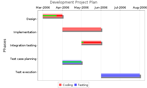
}]ChartsBasicGantt Chart[{ GanttChart title='Development Project Plan' yaxislabel='Phases'
:Name|String, Start|Month, End|Month, Percentage
Coding
* 'Design', 3-2006, 4-2006, 0.7
* 'Implementation', 4-2006, 6-2006, 0
Testing
* 'Test case planning', 4-2006, 5-2006, 1.0
Coding
* 'Integration testing', 5-2006, 6-2006, 0.1
Testing
* 'Test execution', 6-2006, 8-2006, 0
}]
Dynamic Gantt ChartDynamic Gantt plugin is a new and more flexible tool to visualize Gantt charts in a wiki page. It can display tasks represented by horizontal bars and optionally links between them to express their logical relations. There are two ways to feed data to the plugin. Both of them require that you provide the data in the plugin body. Simple method: Wiki table format You must specify the tasks and optionally the links by using the familiar wiki syntax for table data. The advantage of this method is its simplicity, but you cannot use all the advanced features of the underlying Gantt component. [{DynamicGantt
| 1 | First Task | 2015-03-10 | 3 | 0.5 | | true |
| 2 | Another Task | 2015-03-15 | 5 | 0.7 | 1 |
| 3 | Third Task | 2015-03-09 | 2 | |
| 4 | Fourth Task | 2015-03-17 |
| 1 -> 2 | finish-to-start |
| 4 -> 3 | finish-to-finish |
| 2 -> 3 | start-to-start |
}]The columns of the task table (and their default values):
The columns of the links table (the entire table is optional):
For both tables, to use the default values, you can omit trailing cells or just leave them empty. Advanced method: JSON format This way you can take advantage of the full potential of the underlying Gantt component. Disadvantage is the syntax being less concise and more technical. To see which properties are supported, check out this documentation Please notice that you have to specify the inputType parameter set to 'json' to use this feature. [{DynamicGantt inputType='json'
{
data:[
{id:1, text:"Project #1",start_date:"2013-04-01", duration:11,
progress: 0.6, open: true},
{id:2, text:"Task #1", start_date:"2013-04-03", duration:5,
progress: 1, open: true, parent:1},
{id:3, text:"Task #2", start_date:"2013-04-02", duration:7,
progress: 0.5, open: true, parent:1},
{id:4, text:"Task #2.1", start_date:"2013-04-03", duration:2,
progress: 1, open: true, parent:3},
{id:5, text:"Task #2.2", start_date:"2013-04-04", duration:3,
progress: 0.8, open: true, parent:3},
{id:6, text:"Task #2.3", start_date:"2013-04-05", duration:4,
progress: 0.2, open: true, parent:3}
],
links:[
{id:1, source:1, target:2, type:"1"},
{id:2, source:1, target:3, type:"1"},
{id:3, source:3, target:4, type:"1"},
{id:4, source:4, target:5, type:"0"},
{id:5, source:5, target:6, type:"0"}
]
}
}]
Optional parameters You can provide these optional parameters to the plugin that allow more advanced customizations:
Pie Chart[{ PieChart title='Unit tests' threed='true'
Successful, 22
Failure, 13
Error, 2
}]
Polar Chart[{ PolarChart title='Database Performance Comparison'
MySQL
* 60, 290
* 23, -120
* -45, 90
PostgreSQL
* -10, 200
* -12, -30
* 13, 140
}]
Scatter Plot Chart[{ ScatterPlotChart title='System downtime'
Accounting
* 10, 20
* 22, 30
* 33, 45
Reporting
* 60, 10
* 23, 42
* 45, 29
}]
Stacked Area Chart[{ StackedXYAreaChart title='Issues Over Time' legend='true'
:Date|Day|MM/dd/yyyy,Blocking,Critical,Minor,Cosmetic
03/22/2006,9,17,13,16
03/23/2006,4,8,14,19
03/24/2006,7,11,11,12
03/25/2006,5,6,11,6
03/28/2006,0,1,6,3
}]
Time Series Chart[{ TimeSeriesChart title='Contributors Over Time'
Programmers
* 10/7/2006, 22
* 12/6/2006, 30
* 11/1/2006, 49
Managers
* 10/9/2006, 2
* 12/13/2006, 4
* 11/8/2006, 2
Testers
* 10/3/2006, 3
* 12/22/2006, 8
* 11/7/2006, 12
}]
Area Chart[{ XYAreaChart title='Commits By Team'
Team A
* 10, 20
* 12, 30
* 13, 45
* 40, 10
Team B
* 60, 10
* 23, 12
* 45, 50
}]
Line Chart[{ XYLineChart title='System Response Time'
Queries
* 10, 20
* 20, 30
* 30, 45
Report Generator
* 10, 40
* 20, 20
* 30, 10
}]
Step Area Chart[{ XYStepAreaChart title='Lines-of-Code Over Weeks'
LOC
* 1, 7545
* 2, 8987
* 3, 7788
* 4, 8544
* 5, 10344
}]
Bar Chart[{ BarChart title='Number-of-classes By Package' threed=true orientation=horizontal
:Package|String, Classes
persistence, 32
remoting, 16
utils, 23
}]
Stacked Bar Chart[{ StackedBarChart title='Issues By Version' seriespaint='red,orange,green' threed=true orientation=horizontal
:Version|String, 0.7-pre, 0.9-rc1, 1.0-final
Fatal, 10, 6, 1
Major, 23, 11, 4
Minor, 15, 3, 6
}]
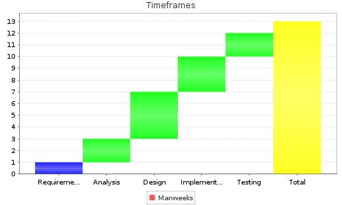
Waterfall Chart[{ WaterfallChart title='Timeframes'
:Phase|String, Requirements Capture, Analysis, Design, Implementation, Testing, Total
Manweeks, 1, 2, 4, 3, 2, 13
}]
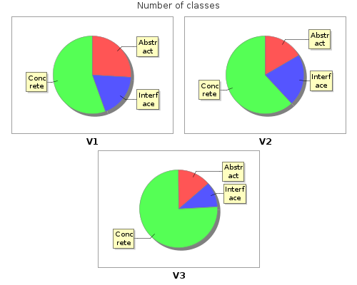
Multiple Pie Chart[{ MultiplePieChart title='Number of classes' legend='false' height=400
:Country|String, V1, V2, V3
Abstract, 7, 7, 4
Interface, 5, 9, 3
Concrete, 15, 26, 22
}]
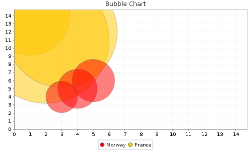
Bubble Chart[{ BubbleChart title='Bubble Chart' seriespaint='red,orange'
Norway, 10, 10
*3, 4, 2
*4, 5, 2.5
*5, 6, 2.7
France, 15, 15
* 1, 14, 5
* 3, 12, 7
* 2, 11, 8
}]
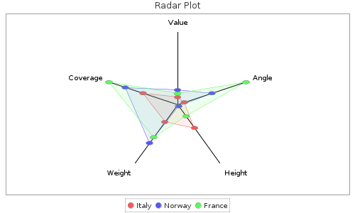
Spider Web Chart[{ SpiderWebChart title='Radar Plot' direction='clockwise' webfilled='true'
headpercent='0.02' axislabelgap='0.1' interiorgap='0.2'
:Country|String, Value, Angle, Height, Weight, Coverage
Italy, 10, 10, 40, 30, 50
Norway, 20, 50, 3, 66, 76
France, 15, 100, 20, 56, 100
}]
Gauge Chart[{ GaugeChart minimum='0' positions='6,16,24' maximum='30' value='27' name='name' valueLabel='label' seriespaint='RED,YELLOW,GREEN' width='500' height='300'
}]
Spedometer Chart[{ SpeedometerChart minimum='0' positions='6,16' maximum='30' value='27' name='name' valueLabel='label' seriespaint='RED,YELLOW,GREEN' width='500' height='300'
}]
Printing to PDFFreely configurable printing is supported by using a dedicated plugin ExportWiki. This is able to print a single or multiple pages (in configurable order) to PDF easily. The file to be printed is defined once in a wiki. Then the plugin generates a download link, which recreates the up to date content in PDF format any time later, when the link is selected from the wiki view. Export Wiki PluginThe ExportWiki plugin generates a download link for PDFs exported from wiki pages. [{ExportWiki id='1004,1005' format='pdf'}]
Parameters:
Examples of Use [{ExportWiki id='1004,1005' path='/myexports/mywiki.pdf' dpi='300'}]
will save the resulting file mypages.pdf in the myexports folder. [{ExportWiki id='1004' path='result.rtf' format='rtf' footerText='Some footer text'}]
will create result.rtf in root folder of the Document Manager. MiscellaneousExcel Spreadsheet Plugin[{Excel id='1067'}]
displays the content of the Microsoft Excel spreadsheet having the identifier 1067. Alternatively, you can use one of the following snippets, if your spreadsheet is not stored in the Document Manager, but is attached to a wiki page: [{Excel src='175'}]
[{Excel src='calculations.xls'}]
[{Excel src='Another page/calculations.xls'}]
You can identify the file by its attachment ID, filename (if it's attached to the current page) or page name and filename (if it's attached to another page). [{Excel src='http://www.mysite.com/files/calculations.xls'}]
will display the spreadsheet from the given URL. The optional parameter sheet can contain the name of a sheet. If not given all sheets will be processed. The optional parameters maxRows and maxColumns can be used to limit the number of rows/columns rendered on the wiki page. The default limits are 1000 rows and 100 columns. Word PluginWord plugin displays content of a Microsoft Word 2007 (or higher, older formats are not supported) document. The Word plugin will automatically detect the file format and convert the Word document to HTML and embeds that to the Wiki page. Also displays images, however it can only display images supported by the browser. Usage is same as the , so src attribute can contain references to Word files attached to current Wiki page or external or internal URLs. Examples: [{Word id='1067'}]
displays the Word document #1067 which is stored in Document Management. Jenkins Build Trends and Jenkins Performance Trends PluginDraws a chart based on the attachment uploaded by the For unit based tests: [{JenkinsBuildTrends}]
For performance tests: [{JenkinsPerformanceTrends}]
Shockwave (SWF) Plugin
Starting from codebeamer 10.1.0 this plugin is no longer supported and removed because of Adobe Flash plugin vulnerabilities.
Embeds an SWF file into a wiki page.
Examples: [{Flash src='!12!'}]
[{Flash src='!mygame.swf!' controls='false'}]
[{Flash src='!/1034!' parameters='param1=value1¶m2=value2'}]
[{Flash src='!/mydir/mygame.swf!'}]
See more examples at the a Flash plugin Google Maps PluginEmbeds Google Maps [{GoogleMaps lat='48.738142' lng='9.111185' zoom='17'}]
will show you the exact location of the Intland Software headquaters. See more examples with markers and lines at the Google Maps plugin Note: this plugin requires to obtain an API key from Google Maps codebeamer-specific extension:
In that case the lat, lng and zoom parameters will be ignored. Instead of that, a correct pan/zoom will be applied to make all of markers visible. If used outside of any project context, then the projectId parameter must be specified.
Feed PluginIncludes content feeds (of any version of RSS and Atom [{Feed url='http://slashdot.org/index.rss' feedDetails='true'}]
will display the latest news from Slashdot [{Feed url='http://feeds.feedburner.com/Techcrunch' entryDetails='true' max='5'}]
will display the 5 latest news with their details. Parameters (with defaults):
Color Code PluginPlugin that renders the body text as colorized source code. [{ColorCode syntax='sql'
select count(*) from dual
}]
Parameters: syntax='sql | c | java | vm'.
See more details on the plugin's home page: http://www.ecyrd.com/JSPWiki/wiki/ColorCodePlugin_page Color Code Plugin examples- Single line comments using # [{ColorCode syntax='sql' tokenizer.wordChar:'#' colorcode.comment.singleline.pattern='#'
# Default Installation parameters
innodb_buffer_pool_instances=8
}]
Result: #Default Installation parameters innodb_buffer_pool_instances=8 - Multi-line comments in c [{ColorCode syntax='c' tokenizer.wordChar:'/,*' colorcode.comment.multiline.pattern:'/*,*/'
/*
* This program takes age input from the user
* It stores it in the age variable
* And prints the value using printf()
*/

 /* Code below */

#include <stdio.h>

int main() {

  int age;

  printf("Enter the age: ");
  scanf("%d", &age);

  printf("Age = %d", age);

  return 0;
}
}]
Result:
/*
* This program takes age input from the user
* It stores it in the age variable
* And prints the value using printf()
*/
/* Code below */
#include <stdio.h>
int main() {
int age;
printf("Enter the age: ");
scanf("%d", &age);
printf("Age = %d", age);
return 0;
}
Include PluginPlugin includes wiki markup. An included document can include others. [{Include id='1004'}]
Parameters:
HTML Plugin[{Html
<b>bold</b> normal <em>italic</em>
}]
displays bold normal italic. [{Html id='2124'}]
displays the content of the html document having the identifier 2124. Alternatively, you can use one of the following snippets, if your markup is not stored in the Document Manager, but is attached to a wiki page: [{Html src='175'}]
[{Html src='markup.html'}]
[{Html src='Another page/markup.html'}]Math and Latex PluginsMath plugin is capable of rendering mathematical formulas in Wiki. These formulas Behind the scenes, the Math plugin is using the more powerful Latex plugin for rendering the content.
Before 20.11 LTS (Carmen) For both plugins, some extra configuration is necessary which is described in the
Since 20.11-SP2 There is an Application Configuration option to control the font size globally for the Math and Latex plugin also. "latexPlugin" : {
"defaultFontSizePx" : 24
}
Samples: [{Math
2\sum_{i=1}^n a_i \;\int_a^b f_i(x)g_i(x)\,dx
}]
displays the mathematical formula as an image: The more flexible Latex plugin needs a complete LaTeX formatted document like in this example: [{Latex title='some text'
\documentclass{article}
\pagestyle{empty}
\begin{document}
this some LaTeX text
\end{document}
}]
is rendered as:
The example below shows how to use formula identifiers: [{Math
\( x > y \)
}]
is rendered as:
or [{Math
\[
\frac{\frac{1}{x}+\frac{1}{y}}{y-z}
\]
}]
is rendered as:
Parameters:
Deprecated parameters (not processed since 20.11-LTS Carmen):
Emoticons
(For each smiley, you can write the longer version :-)
instead of :)
if you prefer Traceability Browser
This plugin is deprecated from codebeamer 10.0.0.
Traceability Browser plugin shows a table that correlates any number of sets of any trackers or tracker types in a desired order and visualizes the dependencies (incoming and/or outgoing associations and/or references) between the items corresponding the neighboring selected trackers and/or tracker types. The same table will appear as in Traceability Browser. Parameters:
Examples: [{TraceabilityBrowser initialTrackerList='12345' trackerList='0,2 12356'}]
Shows a Traceability Browser, the initial tracker will be the tracker with ID 12345, the Level 1 will be "All" items, Level 2 will be "Bugs" type items or the Tracker with ID 12356. All the relation types and directions will be displayed.
[{TraceabilityBrowser initialTrackerItemId='1234' trackerList='0,0' showIncomingAssociations='true' showIncomingRelations='true' showOutgoingAssociations='false' showOutgoingRelations='false'}]
Shows the incoming associations and references of the 1234 Item in two Levels (displaying all Items, no filter by tracker type or tracker).
[{TraceabilityBrowser preset='Preset_Name'}]
Shows a Traceability Browser which represents a saved preset called "Preset_Name".
Traceability MatrixTraceability Matrix plugin renders trace-ability report between one or more trackers and their views in a Matrix form. Parameters:
Additionally to the parameters the matrix's body optionally can contain a Velocity script
Here is an example of usage with a customized cell content: [{TraceabilityMatrix horizontalTrackersAndViews='1250' verticalTrackersAndViews='1250'
#set($field = "Software safety classification")
#set($safetyHorizontal = $resolver.getItemFieldValueByFieldName($horizontalTrackerItem, $field))
#set($safetyVertical = $resolver.getItemFieldValueByFieldName($verticalTrackerItem, $field))
#set($color ="")
#if ($safetyHorizontal == "A" || $safetyVertical == "A")
#set($color ="green")
#end
#if ($safetyHorizontal == "B" || $safetyVertical == "B")
#set($color ="orange")
#end
#if ($safetyHorizontal == "C" || $safetyVertical == "C")
#set($color ="red")
#end
#if ($color != "")
#set($cssStyle = "background-color: ${color};")
#end
${content}
}]Risk Traceability MatrixRisk Traceability Matrix plugin renders a trace-ability report between two or more trackers based on their associations in a Matrix form. You can specify a comma separated list of tracker IDs in the trackers parameter. The generated matrix will contain the corresponding trackers in the very same order, one column representing one tracker. [{RiskTraceabilityMatrix trackers='1035,1032,1034,1029'}]
The matrix rows will contain tracker items. By default all of the items will be displayed (with respect to the generation rules, see below), but you may also manually exclude particular tracker items from any of the trackers. To do that, just add the tracker ID(s) or key(s) in parentheses after their containing tracker, separated by dashes, like this: [{RiskTraceabilityMatrix trackers='1035(1123),1032,1034(1341-1322-1345),1029'}]
The matrix will be generated based on the following rules:
Other optional parameters:
ExampleIn this example, we use letters as IDs to make it easier to follow: Assume we have 4 trackers, their IDs are: A,B,C,D
Associations:
will generate this matrix:
EscapingThe following characters in the Rich Text view will be escaped with tilde |[]\\#-!'_^{}%,> |

codebeamer Overview codebeamer Knowledge Base Services by Intland Software |
|||||||||||||||||||||||||||||||||||||||||||||||||||||||||||||||||||||||||||||||||||||||||||||||||||||||||||||||||||||||||||||||||||||||||||||||||||||||||||||||||||||||||||||||||||||||||||||||||||||||||||||||||||||||||||||||||||||||||||||||||||||||||||||||||||||||||
 anonymous

")
")
")
")

")
")
")
")
")

")
")

")

")
")

")
")


 Hotkeys